


Client
Danone Direct is an online store for a major international food manufacturer.
Challenge
The Danone Direct grocery delivery service ran on Magento 1. Because of the outdated Magento version, it was slow and buggy (catalog loading could take more than 10 seconds). Site conversion was 0.06%. The site was not positioned as a subscription service.
Solution
- Website Redesign
- Designing the Business Logic for One-Time Purchase and Delivery Subscription
- Seamless Migration to Magento 2
- PWA Frontend Implementation on Vue Storefront
- Implementation of Two-Way Social Login
- Redesign of the Catalog and Subscription Service
- 1C Inventory Integration
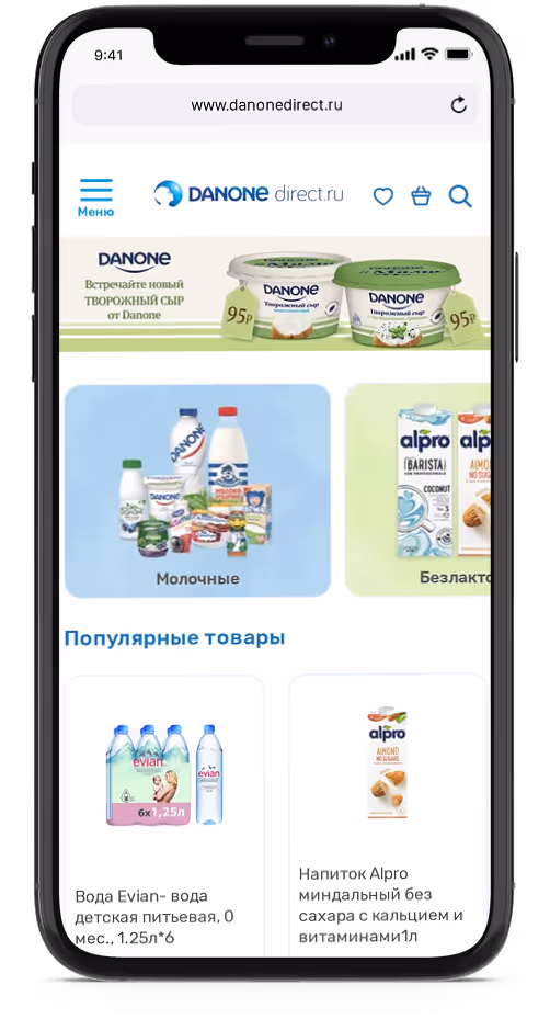
Migration to Magento 2 and PWA Implementation
The first step was migrating from Magento 1 to Magento 2. To improve site loading speed, we implemented PWA (Vue Storefront, SPA). A web server built on Node.js was used as the backend for the frontend, with Elasticsearch as the database.
Review a similar project with an architect
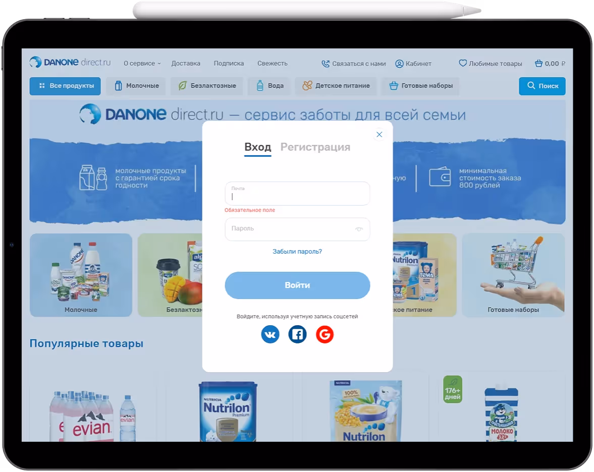
Social Login
Social login is a custom Vue Storefront solution. To simplify registration, our developers added a Magento module and also created endpoints so users could sign in via VKontakte and Facebook or with a Google account.
1C Inventory Integration
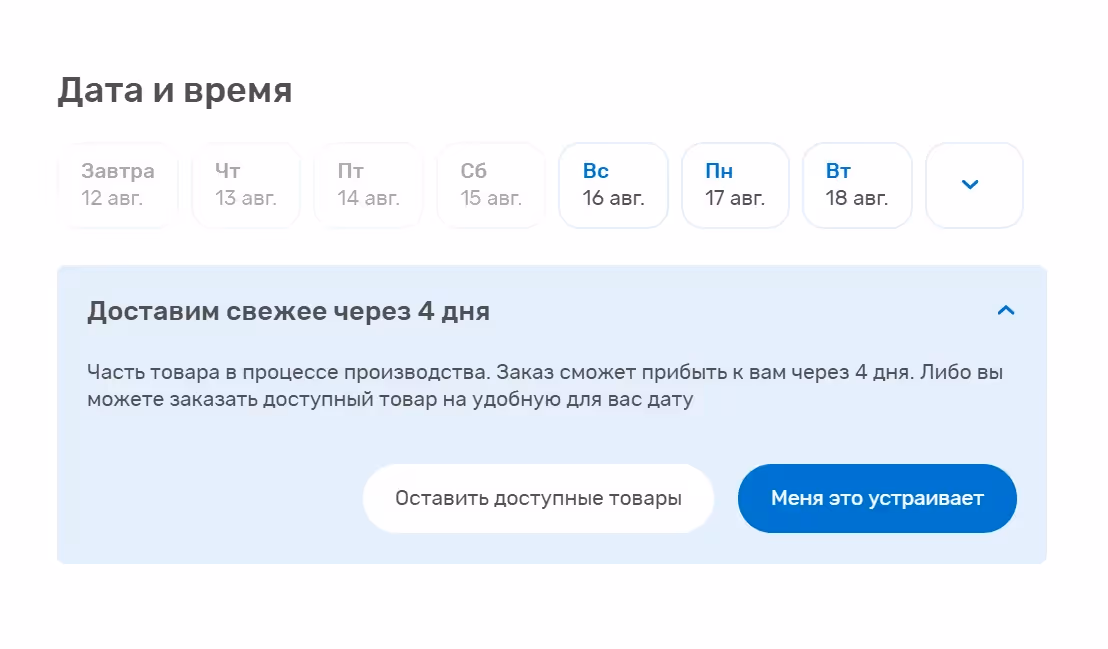
The old version of the site had the following problem: stock levels were not reflected properly, and users often ordered items that were not in stock. Managers had to call customers and offer alternative products. Our developers integrated 1C with Magento so the full product assortment would be available on the site, and if an item was out of stock, the user could place a pre-order.
For example, if a user adds to the Cart a product that is not available in the required quantity, a notification appears on the site saying that the item will be delivered in four days.
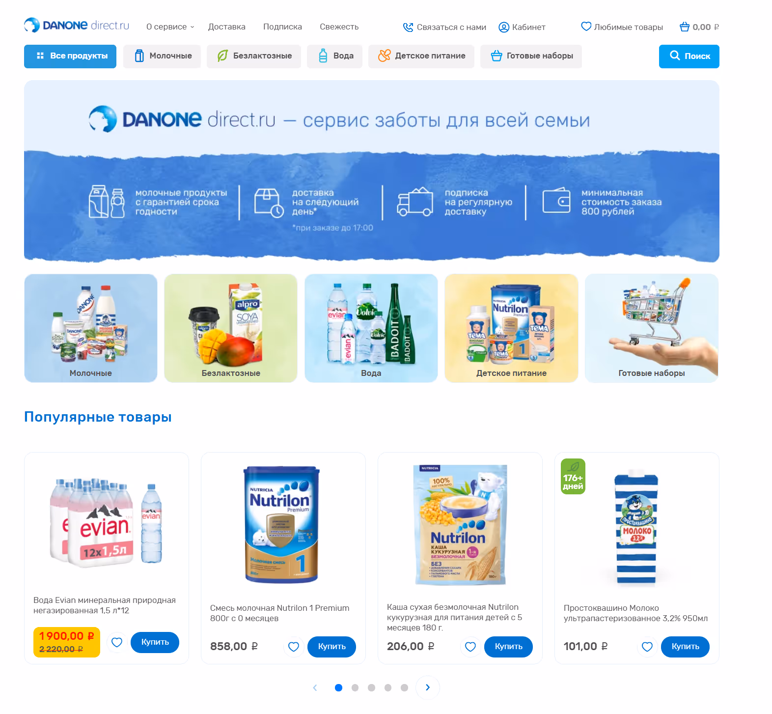
Website Redesign
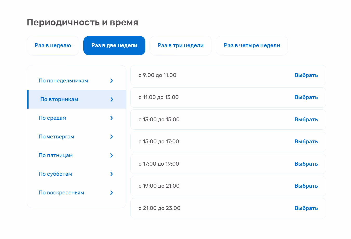
The main goal of the redesign was to rework the product subscription service. Customer development showed that the first version of the interface was not fully clear to users: they were unfamiliar with subscription options, and the live site lacked any explanations. The subscription calendar was also not intuitive enough, and users felt that the checkout flow itself was one-time only.
Google Analytics data showed that at the checkout stage, about 70% of users left the site without completing a purchase. Based on the analytics, our designers completely redesigned the subscription interface, making it clearer by highlighting three main steps: delivery frequency, day, and time.
To remove barriers for customers before using the new subscription service, we decided to expand the site by creating separate pages for the Subscription and Delivery services, where we answered the main customer questions and addressed their concerns.

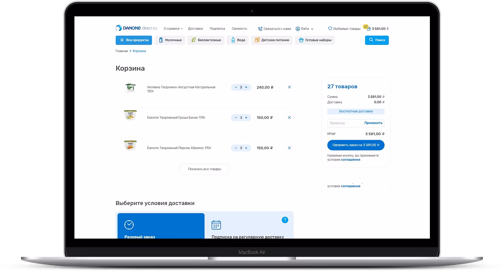
Checkout Redesign
The previous checkout consisted of four steps, each on a separate page. We simplified the purchase flow by making checkout a single page and adding the option for guest checkout.
Results
The results of the redesign and site functionality optimization were impressive. In almost a year and a half:
average order value increased from 1,294.37 RUB to 3,111.31 RUB
monthly revenue increased from 89,311.82 RUB to 1,051,623.51 RUB
site conversion increased from 0.14% to 1.25%